SUSHIRRITO
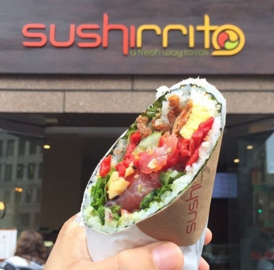
360 brand development for the launch of Sushirrito, a made-to-order, sustainable sushi concept designed to scale from day one.
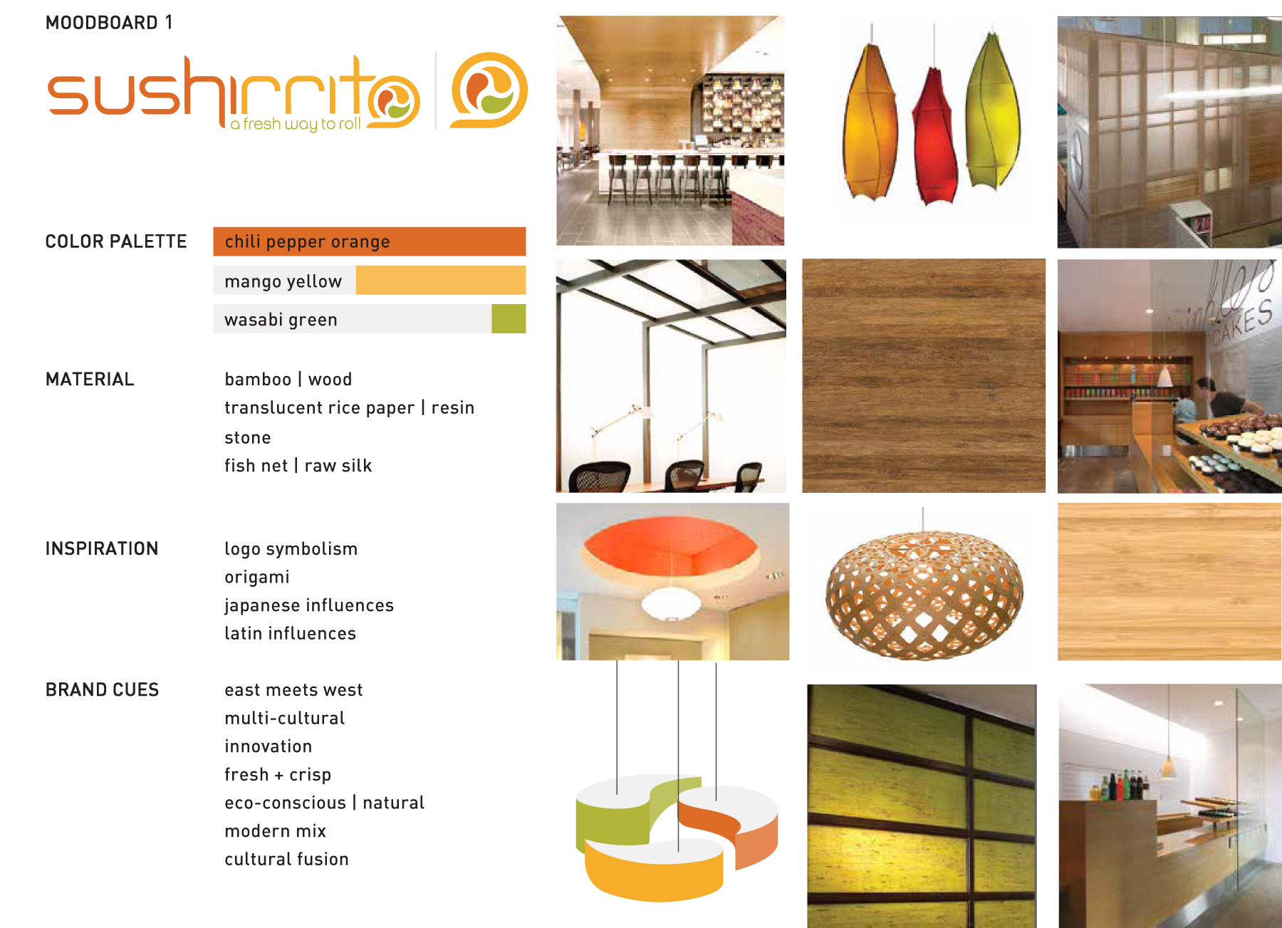
Rooted in sustainability, this Asian/Latin fusion concept inspired the logo using the harmony symbol to represent the cross-section of a maki roll. Conscious selection of fish, organic rice, and local produce differentiated Sushirrito and has attracted a healthy and loyal clientele from coast to coast.
BRAND GUIDELINES
LOGO
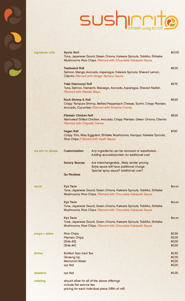
MENU & SIGNAGE
NAMING
PACKAGING
PRESENTATION DECKS
RETAIL ENVIRONMENT
SOCIAL VENTURES
WEARABLES
WEBSITE
RECENT WORK


